Friday, 31 May 2013

artista del mes: nadia albertini

The end of May commemorates one year since this blog published its first post. And I can't think of a better way to celebrate this very special occasion than by introducing Nadia Albertini.
Nadia's mom is one if my dearest, oldest friends (a gifted book artist and special art projects director), which means I met Nadia when she was just an adorable little girl, along with her just as adorable baby sister.
Fast forward a couple of decades, and you will find Nadia as one of the top representatives of the next generation of extremely talented textile/fibre artists. And that just makes me deliriously happy. For someone so young, she has had an impressive trajectory, everyday adding magnificent pieces to her already awe-inspiring portfolio. She has worked in unbelievable projects for many design houses and designers in the couture industry world wide, while continuing to keep an extremely grounded, hard working, professional and generous work ethic.
©Nadia Albertini.

IN HER OWN WORDS: AN INTERVIEW
Ana: WHAT LEAD YOU TO A CAREER IN TEXTILES AND FASHION?
Nadia: I was born in Mexico City in a family where art and design are very important. My parents had a book-binding atelier, so I always saw them making things with their hands. I think seeing my grandmother doing embroidery was also very inspiring, even if I wasn’t aware of it at the time. As a kid, I could spend hours drawing, painting. I enjoyed silk painting too but I never thought about studying textiles or fashion. That world was very far from ours. It all really started when I was 15, when I participated in the International Swarovski Elements Accessories Design Competition. We were to use their materials to embellish a fashion accessory. I remember I could have all the stones and beads and rhinestones I wanted for my project. I fell in love with their shine. After graduating from high school I moved to Paris to study textiles and fashion at the Duperré School of Applied Arts. I didn’t know what I wanted to do exactly but then, I had my first internship at Chloé. And they needed help in the embroidery department. So I helped with the making of samples, hand embroidery swatches, fabric manipulations. It was a mix of a lot of techniques, some of which I learned from my grandmother. We had the chance to work with different materials from the best suppliers.  After two months there, I knew I wanted to be an embroidery designer.
©Nadia Albertini. Detail.
Ana: WHERE DO YOU GET YOUR INSPIRATION FROM? DO YOU FOLLOW A DESIGN PROCESS?
Nadia: The inspiration really depends on who I’m working for. But the design process is similar from one brand to the other. I usually discuss the main inspiration with the head designer or creative director. They give me their main inputs, like “China” or “mosaic” or “Versace from the 80’s” or “Marie Laurencin colors”. Inspirations are complex and very different from one season to the other. Then, once I have this guideline, I do my own research. I can spend days in the library, it’s probably one of my favorite parts of the job. Sometimes you are looking for a certain type of image and it happens that you find something else, completely opposite. But then it works! We must always be open to new things.  I often go to London for the day to do research at the Central Saint Martins Library or at the Victoria and Albert Museum. I come back with about 600 images that I submit to the studio. Then we build “the stories”, the main ideas that we would like to develop in the shape of swatches for the season.
This part is nice too, but it’s much more technical and you have to be very focused. You have to be able to imagine a sample in advance so to know what to ask from the embroidery ateliers we work with. Most of the time, I make small samples for them to follow. I like making things myself, especially when it’s a subtle combination of materials.
©Nadia Albertini.

Ana: DURING THE DESIGN PROCESS (THOUGH YOU ALREADY MENTIONED IT IS CLIENT SPECIFIC), IS THERE A SUGGESTION OF YOUR MULTICULTURAL BACKGROUND IN THE WORK YOU PRODUCE?
Nadia: There is, yes. My sister and I were always educated in both languages and both cultures, which gave us a very rich base for everything we do. I think being French/Mexican and having been raised in Mexico City surrounded by so much color and patterns trained my eye from a very young age. I remember wearing all sorts of embroidered and hand woven huipiles when I was a kid. We used to make trips to the countryside very often, especially to Oaxaca, to discover the most amazing places and crafts. I think we had a very free and inspiring childhood in Mexico, I don't think it would have been the same had we lived in Paris from a young age. Also, Mexican people do think outside the box. If we don't know how to make something, we try different things, we experiment, we explore possibilities, some of them quite surprising and unexpected. It is what my mom calls the "ingenio mexicano". It's a very instinctive, intuitive way of doing things and I hope to have a hint of that in my work.
©Nadia Albertini.

Ana: WHAT IS IT THAT YOU LIKE THE MOST ABOUT YOUR CURRENT WORK?
Nadia: I love to be able to collaborate with very different brands and designers who have very different personalities, especially since I never imagined having the chance to work in this field.
I like every single part of the job, from the research, to the development, the sketching, the stressful days before the shows, the last minute changes before the dress goes on the runway.
I’ve had the chance to meet and work with very talented and inspiring people, either in Paris, London, New York or Mumbai. That’s what I like the most. 
©Nadia Albertini.

Ana: ARE THERE ANY MATERIALS THAT YOU TEND TO RESPOND MORE KEENLY TO?
Nadia: Embroidery allows us to use any sort of materials. For Balmain, for example, I designed embroideries made entirely of raffia. Not exactly the easiest material but it was very exciting. I like to transform a regular material so that people ask themselves: what is that dress made of? It goes from pleated tulle, hammered cora springs (a material often used in traditional Indian saris), folded and burnt sequins. I like the fact that embroidery offers endless possibilities.
©Nadia Albertini.

Ana: WHAT CLASS ARE YOU CURRENTLY TEACHING IN LONDON?
Nadia: Two to three times a year, I go to London to teach the short course named ‘Couture Embellishment’ at the London College of Fashion. It’s a small group, about 13 to 15 students, I like to give individual time and attention to each of them. They learn to dye their own fabrics and threads, traditional embroidery stitches but also fabric manipulations and 3D embroidery with sequins and beads. During that week, they also learn the embroidery design process: selecting inspiration images, building a mood board. They create their own design and learn how to transfer it to the fabric and how to use a professional embroidery frame. 
©Nadia Albertini.

Ana: YOU TRAVEL OFTEN TO INDIA, WHAT HAS BEEN THE MOST SIGNIFICANT EXPERIENCE WHILE WORKING THERE?
Nadia: I love going to India. Every project and every team is different and I learn new things every day. Funny, when you know I don’t speak hindi and most of the people I work with don’t speak English.
I have a fond memory about the first time I worked directly with the karigars (the embroidery workers). In France, only women do embroidery.  There, it’s the opposite, only men do. I was trying to explain to them how to do a special technique but I could not find the words. So I took thread and needle, sat down in front of the frame and then… 60 people stopped working to look at me. It scared me a little bit, I thought they did not approve of that. But it wasn’t that, they were just amused and curious.
©Nadia Albertini. Detail.
Ana: HOW IS PARIS INFLUENCING YOUR WORK?
Nadia: Paris is a great source of inspiration. The city itself is beautiful and the architecture and ornamentation is magnificent. We have some really good libraries, like Bibliothèque Forney or the library at Musée Galliera. But there are also all the exhibits, the art galleries, the annual fairs and the new design shops.
Paris has a lot to offer in terms of fabrics and material suppliers because of its history and relationship to the fashion and textile industries. The Ateliers des Métiers d’Art, with whom I have the chance to work very often have been open for more than a hundred years. Some of them are still managed by the founding families who are passionate about their art. They have incredible archives and have mastered the most amazing techniques such as Lunéville and Cornelly embroidery, fabric dyeing, mechanical pleating, feather work, artificial flowers, etc…It’s a privilege to work with them and they only exist in Paris. 
©Nadia Albertini

_______

Sunday, 12 May 2013

food inspired

Good food provides not only nourishment, but if allowed, it also regales us with great sources of inspiration, including of course striking colour palettes.
Here are three examples:

BAJA FISH TACO
Queen West Street houses many of our favourite haunts in Toronto. Here you can find excellent shopping, entertaining and most certainly, food! Grand Electric is the perfect example of the latter. I'm not sure what the story behind the restaurant is, but it has (along with Maizal) the best Mexican food in town. With an eclectic ambiance, and somewhat loud music, they offer a most delicious fish taco (their key lime dessert is simply spellbinding). When my order of tacos arrived the first time we visited, I found them so quaint that my immediate reaction was to take a picture. E looked at me suspiciously since I hardly ever take pictures of food as in my opinion, food tends to photograph unfavourably.
Grand Electric has a section on one of its walls decorated with some Lucha Libre paraphernalia, which I thought would tie-in very well with the Grobet post. The tacos image depict, on the left, a chicken taco, on the right, a fish taco.

LW'S SALAD
One of the advantages of working in a very creative environment, is being surrounded by very creative people who effortlessly make art out of any medium at hand. This image showcases LW's lunch salad. She was giving the final touches to it when I happened to walk by and see it. I stopped on my tracks and commented on the beauty of it, a few seconds later, I was documenting it for posterity. It was perfectly composed, all elements in harmonious balance.

SUNDAY PANCAKES
Though not exclusively, Sunday seems to be the preferred day of the week for pancakes (always made from scratch). We all tend to eat them very differently: E likes them with just a bit of butter. F enjoys them with the superb maple syrup we have been treating ourselves to since living in Toronto (culinarium sells the best in town, seriously). I'm keen on sprinkling them with powder sugar and lots of strawberries.

------ 
After cutting the strawberries this is what I'm always left with: An intriguing  possibility of motifs in the form of strawberry tops arranged in the semblance of a design unit. Today I decided to run with it, here is the resulting design process:
Strawberry tops on cutting board.
With the aid of Photoshop, the strawberry tops exist now without the background and are ready to be put in repeat. A straight repeat moved things along expeditiously during this initial process--I gave myself 10 minutes to resolve the rapport.
This was a very quick, fun, repeat exercise, all with the aid of Photoshop.

------
The next steps consider the motifs themselves, the goal being to push the concept further to fully re-contextualize the design. Some Photoshop filters were used. It is important to disclose that I am not a fan of using filters (in my view, most images altered with filters tend to have a  somewhat  "photoshopy/filtery/ready-made" look), however, in certain instances, they can be convenient sketching tools.
In order to bring the content of this post full circle, the 3 food palettes were brought into play as the platform to generate 3 colourways out of the basic design, which is this one:
Strawberry Tops. ©Ana Galindo for Inkfibre
E pointed out a very under-the-microscope look which granted a fresh start to a design that still had a long way to go. Needless to say, the results were quite unexpected mostly considering they were worked under a very tight (self imposed) time restriction.
Palette: Baja Fish Taco. Design: Strawberry Tops. ©Ana Galindo for Inkfibre.
Palette: LW's Salad. Design: Strawberry Tops. ©Ana Galindo for Inkfibre.
Palette: Sunday Pancakes. Design: Strawberry Tops. ©Ana Galindo for Inkfibre.
The dynamism foisted during this task was very enjoyable and reminiscent of my university years when we worked on "repentinas", meaning a "mini/micro charrette", in this case with no collaborative element.

Last notes on the exercise: End-use and scale need to be determined (I see the repeat at least 15") and I would like to try it as a half-drop repeat (though as a full-drop is working well). If it were to be screenprinted, it would be in at least 3 colours, resolving the films by hand.

Tuesday, 30 April 2013

artista del mes: lourdes grobet

About a year ago, my dear friend DE introduced me to the work of Lourdes Grobet. It happened when I accompanied her to the frame shop to pick out the perfect mat that would do justice to the amazing image she wanted to mount. I was immediately drawn to the artist's distinct aesthetic in the depiction of a Mexico that was blatantly forbidden to me while growing up in the city. Nowadays, outside the restrictions and dogmas of a rather culturally sheltered (read bland) upbringing, I'm able to recognize and admire the vision of portraying and commenting on a lifestyle, a social phenomenon of unapologetic fervency for wrestlers and fans alike.
©Lourdes Grobet. Solar, archival pigment print, 20x20 in. (edition of 15), 1980
ABOUT THE ARTIST
Born in Mexico  City in 1940, Lourdes became another artist directly impacted by the "ruptura" movement, with a remarkable academic background and a most impressive group of preceptors: Kati Horna, Gilberto Aceves Navarro and Mathias Goeritz. The artist is mainly known for her Lucha Libre photographs, however, her body of work is extensive, polarizing and in constant transformation, representing the traditions of a segment in Mexican urban culture.

IN HER OWN WORDS: MEMORABLE QUOTES FROM HER INTERVIEW WITH ANGÉLICA ABELLEIRA
  • "The teachers that most influenced me early on were Mathias, Gilberto and 'El Santo'--The Man In The Silver Mask."
  • "Photography was a solution to all my concerns: image, technique, mass reproduction and social relevance. I consider this last quality fundamental, because it's how you participate in the course of history. At one period in time painters were the visual documentary-makers. It's a role that photographers play in the present: writing history through images."
  • "...the members of my family were all sports fanatics and body worshipers. That pointed me towards wrestlers, whom I hadn't been allowed to see live because of gender issues. I had promised myself not to take photos of indigenous people or with a folkloric bent, but when I started taking pictures of the wrestlers... I found that underbelly of Mexico I was so interested in. Meeting the wrestlers gave me a new perspective. The one that most impressed me was El Santo. He's someone I also consider a teacher of mine."
  • "If I hadn't been a photographer I would've been an anthropologist."

©Lourdes Grobet. El Santo, archival pigment print, 20x20 in. (edition of 15), 1980
©Lourdes Grobet. Blue Demon, archival pigment print, 20x20 in. (edition of 15), 1980

©Lourdes Grobet. Paisajes Pintados / Painted Landscapes, colour slide, 6x6 in. 1981

 ___________
lgrobetdu@yahoo.com

Thursday, 18 April 2013

closer to our heart*

Finally! FINALLY!
Today Rush was inducted into the Rock and Roll Hall of Fame.
Finally! FINALLY!

Rush runs deep in my system. And we go way back.
My older brother and his friends introduced me to the band. I was ridiculously young. First it was Closer To The Heart, then Tom Sawyer. Years later I would discover Time Stand Still all on my own.

It was during art history class in University that Tom Sawyer (the song) came immediately to mind when the work of Kazimir Malevich was introduced. Twenty something years later, it is easy to understand how that association was established given that the artist had a very particular philosophy. He "described his aesthetic theory, known as Suprematism, as 'the supremacy of pure feeling or perception in the pictorial arts.'"--Gallery label text for White on White, MOMA, 2006
Kazimir Malevich, White on White, 1918. Oil on canvas, 79.4 x 79.4 cm. MOMA

Music as an art form easily captures this pneuma, including Rush's unadulterated sounds and tenets. Looking back, the biggest revelation was not the fact that I had made that particular connection, Malevich=Rush. It was the full understanding of the possibilities of working this theorem inversely (certain that Malevich was not listening to Rush while creating his art work). Meaning, how music, if allowed, can become an inexhaustible resource to the visual artist.
Close your eyes and listen. What do you see?

Rush performing Tom Sawyer in Cleveland. Time Machine Tour, 2011.
From the album "Moving Pictures", 1981.

Tuesday, 2 April 2013

elements of textile print design: tessellations

I have been pondering about this particular topic for a while now, given that it is important to delve a bit in it while delivering introductory lectures and demos in repeat pattern. The general perception seems to be that tessellations are a very intricate form of design. The fact of the matter is that some of them can be impossibly complicated, but in terms of repeat pattern design, they tend to be rather simple and straight forward.

The immediate reference most purists think of whenever tessellations are mentioned are the  incredible mosaics in the ancient cultures of the Middle East. An excellent example of this influence is found in Granada, Spain.
Mosaic from the Alhambra, in Granada, Spain

The mosaics at the Alhambra inspired the tessellation work of M.C. Escher, the ultimate Shape Meister according to a more contemporary school of thought.
M. C. Escher, Pegasus, tessellation 105

Of course, those involved in the textile arts will think of tessellations in terms of quilting patterns.
Madeleine quilt (detail) by Kate Busby.


What most of us refer to as a design unit (the bread and butter in the discipline of textile print design) is, in reality, a simple tessellation unit. Though in printed fabrics the outline that defines the design unit is usually not evident, the tessellation is truly stipulated by the limiting lines of said unit (horizontal and vertical) within a precisely measured coordinate system.
From left to right: 1-Tessellation unit or design unit (established as a straight repeat, a.k.a. square repeat, a.k.a. side repeat, a.k.a. full drop repeat). 2-Design units in repeat, side, by side, by side, by side. Tiled or tessellated on the horizontal and vertical planes (tessella-Latin-tile).
Design units printed in repeat without the defining outline, except for that at the top left, which references the limiting lines of the tessellation [the example is another variation of pears, ©ana galindo for inkfibre].
_________
Sting's Desert Rose song with Cheb Mami (from his album Brand New Day, 1999) has what I always perceived as an "Alhambra" sound (that is my immediate Middle East reference, though it is in Spain). A true tessellation of talent and cultures.


_________
Reference material worth your while:
  • Book, Escher on Escher by M.C. Escher / Translated from the Dutch by Karin Ford
    A glimpse into Escher's work in his own words. Succinct, eloquent, enlightening, I found it quite reminiscent of Italo Calvino's Six Memos For The Next Millenium. An excellent reminder of why we want to pay attention to detail and why we want to create something remarkable. There is a Toronto connection.
  • Blog post by George Woideck, click here.

Sunday, 31 March 2013

artista del mes: javier areán

I had the privilege of meeting Javier in the spring of 2009, a few months before moving to Toronto. He spearheaded a certificate course in drawing at the Universidad Iberoamericana, their department of continuing education. He taught the first two modules. Under his very capable tutelage we were able to clearly understand our own potential as artists. It was easy to see a progression in everybody's work, each of us deeply impacted by various aspects of the discipline.
©Javier Areán, from the series múltiplos · multiples

ABOUT THE ARTIST
Javier was born in Mexico City, a member of the post-rupture generation, with a global education (New York and Germany) and roots deeply ingrained in the old world.

IN HIS OWN WORDS: REGARDING HIS TRAJECTORY (translated from Spanish by moi)
"I have been collaborating and contributing to the cultural and academic life of the country [Mexico] since my return 8 years ago. My body of work has been exhibited in galleries and art fairs in Mexico and abroad, the most outstanding ones at Zona MACO, Houston Art Fair and Chic Dessin in Paris. I was recently selected to participate at the X Art Biennial at the Museum of Contemporary Art in Monterrey (MARCO), and was invited to join the Cultural Editorial Council for Reforma news paper."

IN MY OWN WORDS: REGARDING JAVIER'S WORK
Haunting with a keen sense of what was and openly intrigued by "what could have been". Daring, gestural, thematically strong, brilliantly composed.

IN HIS OWN WORDS: REGARDING THE SERIES "ALLES KAPUTT"
Comprised of a series of paintings and works on paper produced over the previous year, the most recent work of Javier Areán (Mexico, 1969) departs from contemporary publications and historical archives – most of them from the 1950s – that document abandoned automobiles at different stages of deterioration.
On occasion, the cars remain in that particular state of calmness that follows an accident or natural disaster, while in others, they become a part of the landscape as a result of abandonment and the passage of time. Deprived of their utility and function, these cars are objects that dwell in our memory as evidence of an interrupted destiny. From Toca / Gallery

©Javier Areán, from the series Alles Kaputt, Alles Kaputt, oil on canvas, 70 x 78 in, 2012
©Javier Areán, from the series Alles Kaputt, Drawing 1, ink on paper, 22 x 29.9 in, 2012
©Javier Areán, from the series Alles Kaputt, Green Crash, oil on canvas, 70 x 80 in, 2011

HIS LATEST PROJECT: RETRACING THE STEPS
Javier will document the
pilgrimage retracing the journey his grandfather made when he left Spain, only the artist's trek will start where his ancestor's ended. A symbolic return to the homeland after a lifetime in exile.
To learn more about the project, click here or here.
________
javier.arean@gmail.com

Thursday, 28 February 2013

artista del mes: alejandra laviada

I recently became aware of Alejandra's work through a communication from diagrama, where she is currently exhibiting alongside Omar Rodríguez-Graham. What struck me at first sight is how the oeuvre of this young and  talented Mexican artist is immediately engaging. From what I just learned, she is mostly known for her photographs, yet she is expanding her vision through painting and sculpture.
©Alejandra Laviada, Blue, 2007.
ABOUT THE ARTIST
Alejandra is an internationally awarded artist, currently living and working in Mexico City, She earned her BFA from RISD, and her MFA from SVA. Her recent body of work testimony of this remarkable background.

IN HER OWN WORDS: REGARDING WHAT ATTRACTED HER TO PHOTOGRAPHY
"I’ve always been passionate about art, and photography felt like the best outlet for my creativity. Since I was little, I always carried a camera around with me, and I think this was a great exercise because it taught me to look at the world in a very specific way. I began to notice all the small details, and see things for their potential as an image.  The photographs are an extension of my eyes, my voice, and a reflection of the way that I perceive my surroundings." From an interview in wow, February 11, 2012.

IN MY OWN WORDS: REGARDING ALEJANDRA'S IMAGES
Innovative, "de propuesta", as we say in México. Intriguing, expansive.

©Alejandra Laviada, Manuel, 2008.
©Alejandra Laviada, Juggling, 2008.
©Alejandra Laviada, Stacking, 2007.
________

limited edition

Early last week, I had the chance to finally reclaim (US term) or strip (Canadian term) the photo stencils on several of my screens.
Going, going...


Pears be gone...
With the aid of emulsion remover  (US term) or "stripper" (Canadian term), and the power washer at CTS (bottom left image), getting the photo stencil off is a rather easy task to perform. The picture on the far right represents the "ghost" image that sometimes remains on the screens after repeated use. These imprints will not affect the next stencil on the screen, but they do become a testimony of projects past.

The tea towels produced in the late fall last year are now absolute limited editions, making them even more precious. They will be available through the inkfibre EtsyShop (opening soon),  another step in the daunting world of entrepreneurship. I just need to fully understand what I'm getting myself into. WWYS--What Would Yoda Say? His comment would definitely be: "Business woman you are not". Indeed. I'm eager to learn, though.

As of right now, the only designs that will continue to be printed are Talavera, and most certainly Pears, the latter one as a new design (or designs, we'll see). In the meantime, a fresh batch of motifs and repeats is on the works, "coming soon to a pillow near you".

Thursday, 31 January 2013

artista del mes: hugo ortega

Hugo, F and I go way, way back, and as time has gone by, we've remained good friends. It is important to disclose this bit of information, because it may be easy to think there could be a lack of objectivity in my words. There is not.
The truth is we've always admired Hugo's work, mainly because he is the ultimate undaunted, restless artist.  The images shown, represent only a snippet of his incredibly vast and diverse body of work. Every time we touch base with him, it seems he is onto something new, always testing the limits of his creative endeavours.
©Hugo Ortega, Mexican Colors #2, oil on panel, 48 x 72 in, 2013
ABOUT THE ARTIST
Born in Mexico City, Hugo Ortega’s commitment to the production of art and non-functional objects, is heavily influenced by an abstract mathematical perspective, developed during his undergraduate studies in Industrial Design at the Universidad Autónoma Metropolitana, Azcapotzalco, in Mexico City. In 1993, as a Fulbright scholar, he pursued a Masters of Fine Arts, Fiber Arts, at the Savannah College of Art and Design. While at SCAD, his creative process mutated from detailed, time-consuming textile constructions (tapestry weaving), into an immediate expressive act of mixed-media acrylic paintings. After graduation he returned to Mexico City to continue his professional endeavours as a designer, educator and assemblage artist.
In 1999 he was awarded a second Fulbright fellowship (one of the few artist/academics in the world to be bestowed with this distinction) to pursue doctoral studies in Art and Art Education at Columbia University, in New York City. His doctoral investigations have been shaped by what happens in and through studio practice.
He has been exhibiting since 1985, participating with fiber art, paintings, drawings, digital art and videos in more than fifty group exhibitions in Mexico, Japan, Germany, India and the United States; and eight solo exhibitions in Mexico City and New York City. He also has a wide experience as a curator and gallery consultant in Mexico and the United States.
Currently, his studio practice emerges from the exploration and manipulation of limited material resources. The creative process is based on reiterative cycles of composition in an attempt to evolve artistic forms through a philosophy of proximity and implementation. The strategies of action remain the same across mediums and everyday events.
He lives in northern México where he owns and runs an open studio gallery.

IN HIS OWN WORDS: ON PAINTING
"Painting is instinctual, a way of doing things, an anxiety that lively plays by going back and forth between intriguing abstractions with intense color and the figurative silent reality stylistically graphic. The process defines the artwork; first, it incorporates strong sudden repetitive strokes that emerge sometimes from frustration or not knowing what will be painted, but define and determine where to go. Afterwards, as any idea becomes clear, the visual noise of the strokes is silenced by the brush's manners that softly difuse the composition."--Hugo Ortega

IN MY OWN WORDS: REGARDING HUGO ORTEGA'S RECENT OEUVRE 
Succinctly said: Powerful, moving, engaging and incredibly prolific. The moment boldly captured in the charged eloquence and zealousness of each brushstroke.
__________
©Hugo Ortega, Building Blocks Blue #1, oil on panel, 48 x 48 in, 2013
©Hugo Ortega, Houses, oil on wood, 36 x 36 in, 2012
©Hugo Ortega, City Dwelling, 26 x 22 in, 2011

©Hugo Ortega, Sailing into the Hudson, oil on wood, 48 x 48 in, 2010
©Hugo Ortega, Paisaje Inquieto / Restless Seascape, oil on canvas, 39 x 31.5 in, 2009
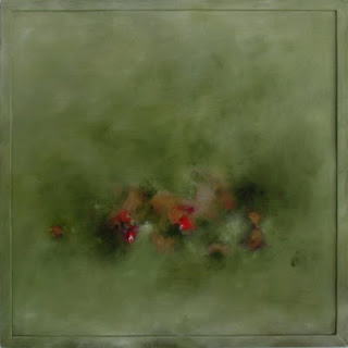
©Hugo Ortega, Paisaje y Flores en Verde, oil on wood, 36 x 36 in, 200
__________
info@hugo-ortega.com