Sunday, 31 March 2013

artista del mes: javier areán

I had the privilege of meeting Javier in the spring of 2009, a few months before moving to Toronto. He spearheaded a certificate course in drawing at the Universidad Iberoamericana, their department of continuing education. He taught the first two modules. Under his very capable tutelage we were able to clearly understand our own potential as artists. It was easy to see a progression in everybody's work, each of us deeply impacted by various aspects of the discipline.
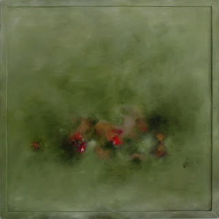
©Javier Areán, from the series múltiplos · multiples

ABOUT THE ARTIST
Javier was born in Mexico City, a member of the post-rupture generation, with a global education (New York and Germany) and roots deeply ingrained in the old world.

IN HIS OWN WORDS: REGARDING HIS TRAJECTORY (translated from Spanish by moi)
"I have been collaborating and contributing to the cultural and academic life of the country [Mexico] since my return 8 years ago. My body of work has been exhibited in galleries and art fairs in Mexico and abroad, the most outstanding ones at Zona MACO, Houston Art Fair and Chic Dessin in Paris. I was recently selected to participate at the X Art Biennial at the Museum of Contemporary Art in Monterrey (MARCO), and was invited to join the Cultural Editorial Council for Reforma news paper."

IN MY OWN WORDS: REGARDING JAVIER'S WORK
Haunting with a keen sense of what was and openly intrigued by "what could have been". Daring, gestural, thematically strong, brilliantly composed.

IN HIS OWN WORDS: REGARDING THE SERIES "ALLES KAPUTT"
Comprised of a series of paintings and works on paper produced over the previous year, the most recent work of Javier Areán (Mexico, 1969) departs from contemporary publications and historical archives – most of them from the 1950s – that document abandoned automobiles at different stages of deterioration.
On occasion, the cars remain in that particular state of calmness that follows an accident or natural disaster, while in others, they become a part of the landscape as a result of abandonment and the passage of time. Deprived of their utility and function, these cars are objects that dwell in our memory as evidence of an interrupted destiny. From Toca / Gallery

©Javier Areán, from the series Alles Kaputt, Alles Kaputt, oil on canvas, 70 x 78 in, 2012
©Javier Areán, from the series Alles Kaputt, Drawing 1, ink on paper, 22 x 29.9 in, 2012
©Javier Areán, from the series Alles Kaputt, Green Crash, oil on canvas, 70 x 80 in, 2011

HIS LATEST PROJECT: RETRACING THE STEPS
Javier will document the
pilgrimage retracing the journey his grandfather made when he left Spain, only the artist's trek will start where his ancestor's ended. A symbolic return to the homeland after a lifetime in exile.
To learn more about the project, click here or here.
________
javier.arean@gmail.com

Thursday, 28 February 2013

artista del mes: alejandra laviada

I recently became aware of Alejandra's work through a communication from diagrama, where she is currently exhibiting alongside Omar Rodríguez-Graham. What struck me at first sight is how the oeuvre of this young and  talented Mexican artist is immediately engaging. From what I just learned, she is mostly known for her photographs, yet she is expanding her vision through painting and sculpture.
©Alejandra Laviada, Blue, 2007.
ABOUT THE ARTIST
Alejandra is an internationally awarded artist, currently living and working in Mexico City, She earned her BFA from RISD, and her MFA from SVA. Her recent body of work testimony of this remarkable background.

IN HER OWN WORDS: REGARDING WHAT ATTRACTED HER TO PHOTOGRAPHY
"I’ve always been passionate about art, and photography felt like the best outlet for my creativity. Since I was little, I always carried a camera around with me, and I think this was a great exercise because it taught me to look at the world in a very specific way. I began to notice all the small details, and see things for their potential as an image.  The photographs are an extension of my eyes, my voice, and a reflection of the way that I perceive my surroundings." From an interview in wow, February 11, 2012.

IN MY OWN WORDS: REGARDING ALEJANDRA'S IMAGES
Innovative, "de propuesta", as we say in México. Intriguing, expansive.

©Alejandra Laviada, Manuel, 2008.
©Alejandra Laviada, Juggling, 2008.
©Alejandra Laviada, Stacking, 2007.
________

limited edition

Early last week, I had the chance to finally reclaim (US term) or strip (Canadian term) the photo stencils on several of my screens.
Going, going...


Pears be gone...
With the aid of emulsion remover  (US term) or "stripper" (Canadian term), and the power washer at CTS (bottom left image), getting the photo stencil off is a rather easy task to perform. The picture on the far right represents the "ghost" image that sometimes remains on the screens after repeated use. These imprints will not affect the next stencil on the screen, but they do become a testimony of projects past.

The tea towels produced in the late fall last year are now absolute limited editions, making them even more precious. They will be available through the inkfibre EtsyShop (opening soon),  another step in the daunting world of entrepreneurship. I just need to fully understand what I'm getting myself into. WWYS--What Would Yoda Say? His comment would definitely be: "Business woman you are not". Indeed. I'm eager to learn, though.

As of right now, the only designs that will continue to be printed are Talavera, and most certainly Pears, the latter one as a new design (or designs, we'll see). In the meantime, a fresh batch of motifs and repeats is on the works, "coming soon to a pillow near you".

Thursday, 31 January 2013

artista del mes: hugo ortega

Hugo, F and I go way, way back, and as time has gone by, we've remained good friends. It is important to disclose this bit of information, because it may be easy to think there could be a lack of objectivity in my words. There is not.
The truth is we've always admired Hugo's work, mainly because he is the ultimate undaunted, restless artist.  The images shown, represent only a snippet of his incredibly vast and diverse body of work. Every time we touch base with him, it seems he is onto something new, always testing the limits of his creative endeavours.
©Hugo Ortega, Mexican Colors #2, oil on panel, 48 x 72 in, 2013
ABOUT THE ARTIST
Born in Mexico City, Hugo Ortega’s commitment to the production of art and non-functional objects, is heavily influenced by an abstract mathematical perspective, developed during his undergraduate studies in Industrial Design at the Universidad Autónoma Metropolitana, Azcapotzalco, in Mexico City. In 1993, as a Fulbright scholar, he pursued a Masters of Fine Arts, Fiber Arts, at the Savannah College of Art and Design. While at SCAD, his creative process mutated from detailed, time-consuming textile constructions (tapestry weaving), into an immediate expressive act of mixed-media acrylic paintings. After graduation he returned to Mexico City to continue his professional endeavours as a designer, educator and assemblage artist.
In 1999 he was awarded a second Fulbright fellowship (one of the few artist/academics in the world to be bestowed with this distinction) to pursue doctoral studies in Art and Art Education at Columbia University, in New York City. His doctoral investigations have been shaped by what happens in and through studio practice.
He has been exhibiting since 1985, participating with fiber art, paintings, drawings, digital art and videos in more than fifty group exhibitions in Mexico, Japan, Germany, India and the United States; and eight solo exhibitions in Mexico City and New York City. He also has a wide experience as a curator and gallery consultant in Mexico and the United States.
Currently, his studio practice emerges from the exploration and manipulation of limited material resources. The creative process is based on reiterative cycles of composition in an attempt to evolve artistic forms through a philosophy of proximity and implementation. The strategies of action remain the same across mediums and everyday events.
He lives in northern México where he owns and runs an open studio gallery.

IN HIS OWN WORDS: ON PAINTING
"Painting is instinctual, a way of doing things, an anxiety that lively plays by going back and forth between intriguing abstractions with intense color and the figurative silent reality stylistically graphic. The process defines the artwork; first, it incorporates strong sudden repetitive strokes that emerge sometimes from frustration or not knowing what will be painted, but define and determine where to go. Afterwards, as any idea becomes clear, the visual noise of the strokes is silenced by the brush's manners that softly difuse the composition."--Hugo Ortega

IN MY OWN WORDS: REGARDING HUGO ORTEGA'S RECENT OEUVRE 
Succinctly said: Powerful, moving, engaging and incredibly prolific. The moment boldly captured in the charged eloquence and zealousness of each brushstroke.
__________
©Hugo Ortega, Building Blocks Blue #1, oil on panel, 48 x 48 in, 2013
©Hugo Ortega, Houses, oil on wood, 36 x 36 in, 2012
©Hugo Ortega, City Dwelling, 26 x 22 in, 2011

©Hugo Ortega, Sailing into the Hudson, oil on wood, 48 x 48 in, 2010
©Hugo Ortega, Paisaje Inquieto / Restless Seascape, oil on canvas, 39 x 31.5 in, 2009
©Hugo Ortega, Paisaje y Flores en Verde, oil on wood, 36 x 36 in, 200
__________
info@hugo-ortega.com

Tuesday, 29 January 2013

marimekko in town

First Frida and Diego at the AGO, now Marimekko, With Love at the Textile Museum... Toronto keeps us well entertained and educated.
For those not familiar with the Finnish company, Marimekko is one of the most iconographic textile houses since the early 50's, when it took the world by storm under the vigilant eye of Armi Ratia and the extraordinary group of designers she recruited to help her launch and establish her vision. One of the most representative designs? Maija Isola's Unikko in red.
Unikko by Maija Isola for Marimekko, 1965.
I have no recollection of when my infatuation with the brand started, I know however, that it was something akin to what the Italians mean when they say "colpo di fulmine". The moment I set eyes on those bold, colourful, unassumingly beautiful designs, I was hooked for life.

MARIMEKKO INSPIRED
During our members meeting at CTS, Rachel suggested we offered a workshop at the studio to tie-in with the Marimekko show at the Textile Museum, and I'm very happy to say I will be teaching it, yay! So in the spirit of it all, Monday, last week, I visited the exhibit, which by the way, had only been open for a couple of hours. It was most interesting to learn about Karelia, the Toronto link with Marimekko from the very late 50's to the late 70's. After the show, and while waiting in the car for E to come out of school, I doodled three designs in my notebook, two of which I knew were ready to go. Just like that! Marimekko inspired, indeed.
Sunday was spent at the studio, finishing films, shooting screens and printing a few samples  of one of the designs in very different colourways, I named it "pebbles".

I'm posting the process, from ideation to print: 1-as a memory of this swift project which helped  review the steps involved in the printing process with my Monday class, 2-to gain insight regarding the outline and content for the workshop, 3-to procure a production-ready design.

Preliminary sketches in the pages of my "handbag" notebook. Hardware equipment: A letter-size photocopier. The design was scaled up to fit comfortably within the screen. Positives (or films) high-tech tools: Mylar, India ink in a chopstick and brush marker, opaque marker, fine sharpie, scissors, utility knife, yellow colour pencil, Canson black paper (for the ground color) and double-sided tape.

Screens shot, no touch-ups necessary. Plenty of tape is needed to mask the edges.

The ground colour (orange) is printed first. Once dry, the outline colour (red) is printed on top. The mysterious object on the side of the screen on the top left image is a brick covered in plastic bags. It helps hold the screen down so it doesn't shift during printing.

Printed samples, in various colourways. The preliminary palettes came from card stock in very vivid colours.

I now need to figure out end-uses (besides pillows), any ideas?
__________________

Tuesday, 8 January 2013

when I'm 64...*

...or 66, I want to have Bowie's inventive fortitude.
He was all over the CBC this morning because of his 66th birthday, and most importantly, because he released a new song after 10 years! Apparently nobody saw it coming, and apparently, we are all loving it.
Bowie has been in my mind for a while since learning about his traveling exhibition David Bowie Is (which will open in Toronto in September!!) and today, these musings and the date collided in amicable conversation, providing the perfect opportunity for a quick reflection, injected with Bowie's creative eccentricities. The following video (found it in youtube) is testimony of how he's never been one for remaining stagnant.
David Bowie, Ziggy Stardust, from his album "The Rise and Fall of Ziggy Stardust and the Spiders from Mars",  1972

I love the Bowie of today, however, I've forever been star-struck by his Ziggy era (which I became aware of a few years after its debut, in my teens).
Bowie, always ahead of his time.

_____________________

FINAL REFLECTION: Music has always been the natural propeller of my days. DB's birthday made me look back into old "anthems" and role models, not because I want to hold on to a chimera, but because they are an important part of who I am. Thanks to such deliberations, this "Cranberries" gem was unburied from the NPR music archives.

______________________
*The title for today's post "when I'm 64" makes reference the The Beatles song, from 1967.

Friday, 4 January 2013

2013

F, my husband, is a very intelligent man. He is also extremely insightful, incredibly pragmatic, creative and has an excellent sense of humour. It is important to mention these very colourful traits of his to give some context to our latest tête-à-tête regarding New Year resolutions. Without going into much detail, we debated around the advantages and disadvantages of making  a resolution versus setting a goal (short-term, long-term, it doesn't matter). The conclusion: Even with the best of intentions, the former is always very easily abandoned, while the latter is realistically achievable. He won.
 

My best wishes for an excellent 2013. ¡Feliz Año!
Ana Torroja, Un Año Más, from Mecano's 1988 album "Descanso Dominical".
Girados concert, with Miguel Bosé. Coliseo La Coruña, 2000.

Monday, 31 December 2012

winter colours

Snow is here, and with it, the colours and sounds of winter are amplified. This is our fourth winter in Toronto, and each year, the phenomenon of snow  continues to captivate us all at home. I love to hear E running down the stairs yelling "it's snowing, it's snowing!"
We enjoy taking walks while the snow is still "untouched", ankle deep and fun, before it turns into a muddy, slushy mess.
First and last images are views from E's bedroom window. The other two, are from our walks.

Crisp, clean, glorious winter days = palettes galore! Here are a few.
From our backyard.

White truly transforms it all.

As of late, I have been paying too much attention to hydrants,
so much so, that I think they are about to become the new pears!

Urban winter palettes: Unexpected, distinctive.

Another day... another year! Almost. I want to sign-off with a good song, a merry song, commemorating 2012 in the company of this highly energetic and creative duo, Pomplamoose.


Pomplamoose, Another Day, released in 2010.

Saturday, 29 December 2012

beyond Frida y Diego

There is no doubt in my mind that Frida and Diego helped shed a lot of the positive cultural light under which Mexico found itself in the first half of the 1900's. From the ground up, they built a very favourable and transcendental perception regarding Mexican art. Nonetheless, there are some reservations to this story, considering Mexican art  acquired an extremely narrow-minded attitude through the prodigious years of the "Mexican School of Painting"* that took at least 4 decades to forgo. This  shake-up was  spearheaded by the young and rebellious artists** of the second half of that century (the "rupture" or "break" generation). 
The casualties of these kerfuffles, as it is the history of humanity, were our female artists. Unbelievably enough, Rivera being the main bully: A female muralist? Nonsense! And Frida somehow overshadowed them all. Why her? Come to think of it then, why not her?
The fact of the matter is that little is known regarding other very talented women artists residing in Mexico, both during the times of the hegemonic MSP* and the years when the status quo was challenged**.
The names of these womenfolk came to my attention in the late eighties and early nineties, when (thankfully) many exhibitions about their body of work could be found in Mexico City. The most memorable ones, personally: Maria Izquierdo, Leonora Carrington, Olga Costa, Lilia Carrillo, Irma Palacios, Remedios Varo, Elena Climent. The latter two my absolute favourites.

From left to right: 1-María Izquierdo, Naturaleza viva, oil on canvas, 1946. 2-Leonora Carrington (born in England), Self portrait, oil on canvas, ca. 1937-1938. 3-Olga Costa (born in Germany), La vendedora de frutas, oil on canvas, 1951.
From left to right: 1-Lilia Carrillo, Premonición, acrylic on canvas, 1970.  2-Irma Palacios, Delta, aquatint, 2003.

From left to right: 1-Remedios Varo (born in Spain), La creación de las aves, oil on masonite, 1958. 2-Elena Climent, Sotorefront, oil on linen, 1992.
Remedios Varo has always been at the top of my list, the master of all masters in my book. Recommendation: In the late 80's, Janet A. Kaplan authored a magnificent book on Remedios Varo, Unexpected Journeys, unfortunately out of print. A fascinating life, a mystifying artist.

The one lesson taken from this week's journey is that I truly don't know much about female or male Mexican artists born after 1980--peccato! Note to self: Learn more about contemporary Mexican art.

___________________________________
*Escuela Mexicana de Pintura: Orozco, Siqueiros, Rivera, Covarrubias, Murillo (Dr. Atl), et al.
**Generación de la Ruptura: García Ponce, Cuevas, Felguérez, Gerzo, Mérida, Goeritz, Gironella, et al.

Wednesday, 19 December 2012

art inspired: Frida y Diego

From 1995 to 1998, F and I had the privilege of living in Coyoacán, Frida Kahlo's neighbourhood in Mexico City. During this time, visits to her house ("La Casa Azul") turned into weekly pilgrimages to this sanctuary of sorts, where I could be found sitting or ambling in tranquil reverie. Her very ingenious talent was ever present, as was the clear connection between her work and the sense of self and place inherent to her pieces. This awareness often sparked a powerful feeling of certainty, never experienced in any other place and every so often, I miss it.
Yesterday, an inkling of that "Casa Azul" notion was recaptured while visiting the exhibit "Frida and Diego, Passion, Politics and Painting". The AGO brought  my Coyoacán back to me, if only for a little while. Though Toronto is home now, the show reminded me of how much I yearn for the explosive and overdramatic cultural scene in Mexico. MÉXICO, vibrant* custodian of prodigious talent.
I like Frida and Diego (Rivera) a lot, and in all honesty, I enjoy them even more on their own and without their politics. Diego's early pieces from his Paris years (ca.1911-1920) are simply incredible, reflecting the obvious influence of the very good company he was keeping while at Montparnasse (Modigliani, Foujita, Chagall and Picasso, to name a few--I can't even begin to imagine what those years must have been like!). My absolute favourite Rivera is from this period, "The Mathematician", in the collection of the Museo Dolores Olmedo Patiño, and currently visiting Toronto (!!!!). Enthralling and quiet wonderment. Brilliant.

Regarding Frida's work, it is hard to decide on a particular favourite. My preferred images, however, came as very pleasant surprises through the lens of Nickolas Muray. I had seen these portraits of Frida plenty of times in postcards and books, but never had the chance to see the actual prints, until yesterday. They are stunning--the saturation and contrast of the colours are mesmerizing. Plus she looks so content, and her hands are beautiful, it seems silly, but I had never noticed them before.

In my opinion, it is important to elaborate on the impact and influence this gifted duo had in Mexican painting, I just need to better organize my thoughts so that they may be set forth succinctly and eloquently, in no way a lecture, but rather, a somewhat informed (I'm no expert) opinion.

For the time being, the song of the day is La Cumbia del Mole. I kept thinking about it throughout my visit to the Gallery. Lila Downs was introduced to me by F in 2007, when we were back in Mexico City. She is a formidable musician and artist, with an unmistakable speck of Frida in her. Seemingly, there is a smidgen of Frida in all us.
---
EMI music is pretty clear about its copyright policies, so in order to avoid problems, I will not post the video. However, click here to view it in youtube with EMI's blessing (Lila Downs, La Cumbia Del Mole, in her album "La Cantina", EMI 2006). Vibrant* is the operative word.