Tuesday, 30 April 2013

artista del mes: lourdes grobet

About a year ago, my dear friend DE introduced me to the work of Lourdes Grobet. It happened when I accompanied her to the frame shop to pick out the perfect mat that would do justice to the amazing image she wanted to mount. I was immediately drawn to the artist's distinct aesthetic in the depiction of a Mexico that was blatantly forbidden to me while growing up in the city. Nowadays, outside the restrictions and dogmas of a rather culturally sheltered (read bland) upbringing, I'm able to recognize and admire the vision of portraying and commenting on a lifestyle, a social phenomenon of unapologetic fervency for wrestlers and fans alike.
©Lourdes Grobet. Solar, archival pigment print, 20x20 in. (edition of 15), 1980
ABOUT THE ARTIST
Born in Mexico  City in 1940, Lourdes became another artist directly impacted by the "ruptura" movement, with a remarkable academic background and a most impressive group of preceptors: Kati Horna, Gilberto Aceves Navarro and Mathias Goeritz. The artist is mainly known for her Lucha Libre photographs, however, her body of work is extensive, polarizing and in constant transformation, representing the traditions of a segment in Mexican urban culture.

IN HER OWN WORDS: MEMORABLE QUOTES FROM HER INTERVIEW WITH ANGÉLICA ABELLEIRA
  • "The teachers that most influenced me early on were Mathias, Gilberto and 'El Santo'--The Man In The Silver Mask."
  • "Photography was a solution to all my concerns: image, technique, mass reproduction and social relevance. I consider this last quality fundamental, because it's how you participate in the course of history. At one period in time painters were the visual documentary-makers. It's a role that photographers play in the present: writing history through images."
  • "...the members of my family were all sports fanatics and body worshipers. That pointed me towards wrestlers, whom I hadn't been allowed to see live because of gender issues. I had promised myself not to take photos of indigenous people or with a folkloric bent, but when I started taking pictures of the wrestlers... I found that underbelly of Mexico I was so interested in. Meeting the wrestlers gave me a new perspective. The one that most impressed me was El Santo. He's someone I also consider a teacher of mine."
  • "If I hadn't been a photographer I would've been an anthropologist."

©Lourdes Grobet. El Santo, archival pigment print, 20x20 in. (edition of 15), 1980
©Lourdes Grobet. Blue Demon, archival pigment print, 20x20 in. (edition of 15), 1980

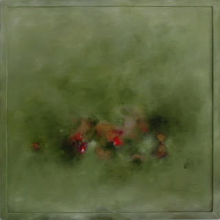
©Lourdes Grobet. Paisajes Pintados / Painted Landscapes, colour slide, 6x6 in. 1981

 ___________
lgrobetdu@yahoo.com

Thursday, 18 April 2013

closer to our heart*

Finally! FINALLY!
Today Rush was inducted into the Rock and Roll Hall of Fame.
Finally! FINALLY!

Rush runs deep in my system. And we go way back.
My older brother and his friends introduced me to the band. I was ridiculously young. First it was Closer To The Heart, then Tom Sawyer. Years later I would discover Time Stand Still all on my own.

It was during art history class in University that Tom Sawyer (the song) came immediately to mind when the work of Kazimir Malevich was introduced. Twenty something years later, it is easy to understand how that association was established given that the artist had a very particular philosophy. He "described his aesthetic theory, known as Suprematism, as 'the supremacy of pure feeling or perception in the pictorial arts.'"--Gallery label text for White on White, MOMA, 2006
Kazimir Malevich, White on White, 1918. Oil on canvas, 79.4 x 79.4 cm. MOMA

Music as an art form easily captures this pneuma, including Rush's unadulterated sounds and tenets. Looking back, the biggest revelation was not the fact that I had made that particular connection, Malevich=Rush. It was the full understanding of the possibilities of working this theorem inversely (certain that Malevich was not listening to Rush while creating his art work). Meaning, how music, if allowed, can become an inexhaustible resource to the visual artist.
Close your eyes and listen. What do you see?

Rush performing Tom Sawyer in Cleveland. Time Machine Tour, 2011.
From the album "Moving Pictures", 1981.

Tuesday, 2 April 2013

elements of textile print design: tessellations

I have been pondering about this particular topic for a while now, given that it is important to delve a bit in it while delivering introductory lectures and demos in repeat pattern. The general perception seems to be that tessellations are a very intricate form of design. The fact of the matter is that some of them can be impossibly complicated, but in terms of repeat pattern design, they tend to be rather simple and straight forward.

The immediate reference most purists think of whenever tessellations are mentioned are the  incredible mosaics in the ancient cultures of the Middle East. An excellent example of this influence is found in Granada, Spain.
Mosaic from the Alhambra, in Granada, Spain

The mosaics at the Alhambra inspired the tessellation work of M.C. Escher, the ultimate Shape Meister according to a more contemporary school of thought.
M. C. Escher, Pegasus, tessellation 105

Of course, those involved in the textile arts will think of tessellations in terms of quilting patterns.
Madeleine quilt (detail) by Kate Busby.


What most of us refer to as a design unit (the bread and butter in the discipline of textile print design) is, in reality, a simple tessellation unit. Though in printed fabrics the outline that defines the design unit is usually not evident, the tessellation is truly stipulated by the limiting lines of said unit (horizontal and vertical) within a precisely measured coordinate system.
From left to right: 1-Tessellation unit or design unit (established as a straight repeat, a.k.a. square repeat, a.k.a. side repeat, a.k.a. full drop repeat). 2-Design units in repeat, side, by side, by side, by side. Tiled or tessellated on the horizontal and vertical planes (tessella-Latin-tile).
Design units printed in repeat without the defining outline, except for that at the top left, which references the limiting lines of the tessellation [the example is another variation of pears, ©ana galindo for inkfibre].
_________
Sting's Desert Rose song with Cheb Mami (from his album Brand New Day, 1999) has what I always perceived as an "Alhambra" sound (that is my immediate Middle East reference, though it is in Spain). A true tessellation of talent and cultures.


_________
Reference material worth your while:
  • Book, Escher on Escher by M.C. Escher / Translated from the Dutch by Karin Ford
    A glimpse into Escher's work in his own words. Succinct, eloquent, enlightening, I found it quite reminiscent of Italo Calvino's Six Memos For The Next Millenium. An excellent reminder of why we want to pay attention to detail and why we want to create something remarkable. There is a Toronto connection.
  • Blog post by George Woideck, click here.

Sunday, 31 March 2013

artista del mes: javier areán

I had the privilege of meeting Javier in the spring of 2009, a few months before moving to Toronto. He spearheaded a certificate course in drawing at the Universidad Iberoamericana, their department of continuing education. He taught the first two modules. Under his very capable tutelage we were able to clearly understand our own potential as artists. It was easy to see a progression in everybody's work, each of us deeply impacted by various aspects of the discipline.
©Javier Areán, from the series múltiplos · multiples

ABOUT THE ARTIST
Javier was born in Mexico City, a member of the post-rupture generation, with a global education (New York and Germany) and roots deeply ingrained in the old world.

IN HIS OWN WORDS: REGARDING HIS TRAJECTORY (translated from Spanish by moi)
"I have been collaborating and contributing to the cultural and academic life of the country [Mexico] since my return 8 years ago. My body of work has been exhibited in galleries and art fairs in Mexico and abroad, the most outstanding ones at Zona MACO, Houston Art Fair and Chic Dessin in Paris. I was recently selected to participate at the X Art Biennial at the Museum of Contemporary Art in Monterrey (MARCO), and was invited to join the Cultural Editorial Council for Reforma news paper."

IN MY OWN WORDS: REGARDING JAVIER'S WORK
Haunting with a keen sense of what was and openly intrigued by "what could have been". Daring, gestural, thematically strong, brilliantly composed.

IN HIS OWN WORDS: REGARDING THE SERIES "ALLES KAPUTT"
Comprised of a series of paintings and works on paper produced over the previous year, the most recent work of Javier Areán (Mexico, 1969) departs from contemporary publications and historical archives – most of them from the 1950s – that document abandoned automobiles at different stages of deterioration.
On occasion, the cars remain in that particular state of calmness that follows an accident or natural disaster, while in others, they become a part of the landscape as a result of abandonment and the passage of time. Deprived of their utility and function, these cars are objects that dwell in our memory as evidence of an interrupted destiny. From Toca / Gallery

©Javier Areán, from the series Alles Kaputt, Alles Kaputt, oil on canvas, 70 x 78 in, 2012
©Javier Areán, from the series Alles Kaputt, Drawing 1, ink on paper, 22 x 29.9 in, 2012
©Javier Areán, from the series Alles Kaputt, Green Crash, oil on canvas, 70 x 80 in, 2011

HIS LATEST PROJECT: RETRACING THE STEPS
Javier will document the
pilgrimage retracing the journey his grandfather made when he left Spain, only the artist's trek will start where his ancestor's ended. A symbolic return to the homeland after a lifetime in exile.
To learn more about the project, click here or here.
________
javier.arean@gmail.com

Thursday, 28 February 2013

artista del mes: alejandra laviada

I recently became aware of Alejandra's work through a communication from diagrama, where she is currently exhibiting alongside Omar Rodríguez-Graham. What struck me at first sight is how the oeuvre of this young and  talented Mexican artist is immediately engaging. From what I just learned, she is mostly known for her photographs, yet she is expanding her vision through painting and sculpture.
©Alejandra Laviada, Blue, 2007.
ABOUT THE ARTIST
Alejandra is an internationally awarded artist, currently living and working in Mexico City, She earned her BFA from RISD, and her MFA from SVA. Her recent body of work testimony of this remarkable background.

IN HER OWN WORDS: REGARDING WHAT ATTRACTED HER TO PHOTOGRAPHY
"I’ve always been passionate about art, and photography felt like the best outlet for my creativity. Since I was little, I always carried a camera around with me, and I think this was a great exercise because it taught me to look at the world in a very specific way. I began to notice all the small details, and see things for their potential as an image.  The photographs are an extension of my eyes, my voice, and a reflection of the way that I perceive my surroundings." From an interview in wow, February 11, 2012.

IN MY OWN WORDS: REGARDING ALEJANDRA'S IMAGES
Innovative, "de propuesta", as we say in México. Intriguing, expansive.

©Alejandra Laviada, Manuel, 2008.
©Alejandra Laviada, Juggling, 2008.
©Alejandra Laviada, Stacking, 2007.
________

limited edition

Early last week, I had the chance to finally reclaim (US term) or strip (Canadian term) the photo stencils on several of my screens.
Going, going...


Pears be gone...
With the aid of emulsion remover  (US term) or "stripper" (Canadian term), and the power washer at CTS (bottom left image), getting the photo stencil off is a rather easy task to perform. The picture on the far right represents the "ghost" image that sometimes remains on the screens after repeated use. These imprints will not affect the next stencil on the screen, but they do become a testimony of projects past.

The tea towels produced in the late fall last year are now absolute limited editions, making them even more precious. They will be available through the inkfibre EtsyShop (opening soon),  another step in the daunting world of entrepreneurship. I just need to fully understand what I'm getting myself into. WWYS--What Would Yoda Say? His comment would definitely be: "Business woman you are not". Indeed. I'm eager to learn, though.

As of right now, the only designs that will continue to be printed are Talavera, and most certainly Pears, the latter one as a new design (or designs, we'll see). In the meantime, a fresh batch of motifs and repeats is on the works, "coming soon to a pillow near you".

Thursday, 31 January 2013

artista del mes: hugo ortega

Hugo, F and I go way, way back, and as time has gone by, we've remained good friends. It is important to disclose this bit of information, because it may be easy to think there could be a lack of objectivity in my words. There is not.
The truth is we've always admired Hugo's work, mainly because he is the ultimate undaunted, restless artist.  The images shown, represent only a snippet of his incredibly vast and diverse body of work. Every time we touch base with him, it seems he is onto something new, always testing the limits of his creative endeavours.
©Hugo Ortega, Mexican Colors #2, oil on panel, 48 x 72 in, 2013
ABOUT THE ARTIST
Born in Mexico City, Hugo Ortega’s commitment to the production of art and non-functional objects, is heavily influenced by an abstract mathematical perspective, developed during his undergraduate studies in Industrial Design at the Universidad Autónoma Metropolitana, Azcapotzalco, in Mexico City. In 1993, as a Fulbright scholar, he pursued a Masters of Fine Arts, Fiber Arts, at the Savannah College of Art and Design. While at SCAD, his creative process mutated from detailed, time-consuming textile constructions (tapestry weaving), into an immediate expressive act of mixed-media acrylic paintings. After graduation he returned to Mexico City to continue his professional endeavours as a designer, educator and assemblage artist.
In 1999 he was awarded a second Fulbright fellowship (one of the few artist/academics in the world to be bestowed with this distinction) to pursue doctoral studies in Art and Art Education at Columbia University, in New York City. His doctoral investigations have been shaped by what happens in and through studio practice.
He has been exhibiting since 1985, participating with fiber art, paintings, drawings, digital art and videos in more than fifty group exhibitions in Mexico, Japan, Germany, India and the United States; and eight solo exhibitions in Mexico City and New York City. He also has a wide experience as a curator and gallery consultant in Mexico and the United States.
Currently, his studio practice emerges from the exploration and manipulation of limited material resources. The creative process is based on reiterative cycles of composition in an attempt to evolve artistic forms through a philosophy of proximity and implementation. The strategies of action remain the same across mediums and everyday events.
He lives in northern México where he owns and runs an open studio gallery.

IN HIS OWN WORDS: ON PAINTING
"Painting is instinctual, a way of doing things, an anxiety that lively plays by going back and forth between intriguing abstractions with intense color and the figurative silent reality stylistically graphic. The process defines the artwork; first, it incorporates strong sudden repetitive strokes that emerge sometimes from frustration or not knowing what will be painted, but define and determine where to go. Afterwards, as any idea becomes clear, the visual noise of the strokes is silenced by the brush's manners that softly difuse the composition."--Hugo Ortega

IN MY OWN WORDS: REGARDING HUGO ORTEGA'S RECENT OEUVRE 
Succinctly said: Powerful, moving, engaging and incredibly prolific. The moment boldly captured in the charged eloquence and zealousness of each brushstroke.
__________
©Hugo Ortega, Building Blocks Blue #1, oil on panel, 48 x 48 in, 2013
©Hugo Ortega, Houses, oil on wood, 36 x 36 in, 2012
©Hugo Ortega, City Dwelling, 26 x 22 in, 2011

©Hugo Ortega, Sailing into the Hudson, oil on wood, 48 x 48 in, 2010
©Hugo Ortega, Paisaje Inquieto / Restless Seascape, oil on canvas, 39 x 31.5 in, 2009
©Hugo Ortega, Paisaje y Flores en Verde, oil on wood, 36 x 36 in, 200
__________
info@hugo-ortega.com

Tuesday, 29 January 2013

marimekko in town

First Frida and Diego at the AGO, now Marimekko, With Love at the Textile Museum... Toronto keeps us well entertained and educated.
For those not familiar with the Finnish company, Marimekko is one of the most iconographic textile houses since the early 50's, when it took the world by storm under the vigilant eye of Armi Ratia and the extraordinary group of designers she recruited to help her launch and establish her vision. One of the most representative designs? Maija Isola's Unikko in red.
Unikko by Maija Isola for Marimekko, 1965.
I have no recollection of when my infatuation with the brand started, I know however, that it was something akin to what the Italians mean when they say "colpo di fulmine". The moment I set eyes on those bold, colourful, unassumingly beautiful designs, I was hooked for life.

MARIMEKKO INSPIRED
During our members meeting at CTS, Rachel suggested we offered a workshop at the studio to tie-in with the Marimekko show at the Textile Museum, and I'm very happy to say I will be teaching it, yay! So in the spirit of it all, Monday, last week, I visited the exhibit, which by the way, had only been open for a couple of hours. It was most interesting to learn about Karelia, the Toronto link with Marimekko from the very late 50's to the late 70's. After the show, and while waiting in the car for E to come out of school, I doodled three designs in my notebook, two of which I knew were ready to go. Just like that! Marimekko inspired, indeed.
Sunday was spent at the studio, finishing films, shooting screens and printing a few samples  of one of the designs in very different colourways, I named it "pebbles".

I'm posting the process, from ideation to print: 1-as a memory of this swift project which helped  review the steps involved in the printing process with my Monday class, 2-to gain insight regarding the outline and content for the workshop, 3-to procure a production-ready design.

Preliminary sketches in the pages of my "handbag" notebook. Hardware equipment: A letter-size photocopier. The design was scaled up to fit comfortably within the screen. Positives (or films) high-tech tools: Mylar, India ink in a chopstick and brush marker, opaque marker, fine sharpie, scissors, utility knife, yellow colour pencil, Canson black paper (for the ground color) and double-sided tape.

Screens shot, no touch-ups necessary. Plenty of tape is needed to mask the edges.

The ground colour (orange) is printed first. Once dry, the outline colour (red) is printed on top. The mysterious object on the side of the screen on the top left image is a brick covered in plastic bags. It helps hold the screen down so it doesn't shift during printing.

Printed samples, in various colourways. The preliminary palettes came from card stock in very vivid colours.

I now need to figure out end-uses (besides pillows), any ideas?
__________________

Tuesday, 8 January 2013

when I'm 64...*

...or 66, I want to have Bowie's inventive fortitude.
He was all over the CBC this morning because of his 66th birthday, and most importantly, because he released a new song after 10 years! Apparently nobody saw it coming, and apparently, we are all loving it.
Bowie has been in my mind for a while since learning about his traveling exhibition David Bowie Is (which will open in Toronto in September!!) and today, these musings and the date collided in amicable conversation, providing the perfect opportunity for a quick reflection, injected with Bowie's creative eccentricities. The following video (found it in youtube) is testimony of how he's never been one for remaining stagnant.
David Bowie, Ziggy Stardust, from his album "The Rise and Fall of Ziggy Stardust and the Spiders from Mars",  1972

I love the Bowie of today, however, I've forever been star-struck by his Ziggy era (which I became aware of a few years after its debut, in my teens).
Bowie, always ahead of his time.

_____________________

FINAL REFLECTION: Music has always been the natural propeller of my days. DB's birthday made me look back into old "anthems" and role models, not because I want to hold on to a chimera, but because they are an important part of who I am. Thanks to such deliberations, this "Cranberries" gem was unburied from the NPR music archives.

______________________
*The title for today's post "when I'm 64" makes reference the The Beatles song, from 1967.

Friday, 4 January 2013

2013

F, my husband, is a very intelligent man. He is also extremely insightful, incredibly pragmatic, creative and has an excellent sense of humour. It is important to mention these very colourful traits of his to give some context to our latest tête-à-tête regarding New Year resolutions. Without going into much detail, we debated around the advantages and disadvantages of making  a resolution versus setting a goal (short-term, long-term, it doesn't matter). The conclusion: Even with the best of intentions, the former is always very easily abandoned, while the latter is realistically achievable. He won.
 

My best wishes for an excellent 2013. ¡Feliz Año!
Ana Torroja, Un Año Más, from Mecano's 1988 album "Descanso Dominical".
Girados concert, with Miguel Bosé. Coliseo La Coruña, 2000.